Hongkiat.com: Logo Design Gone Wrong: 10 Offbeat Examples |

| Logo Design Gone Wrong: 10 Offbeat Examples Posted: 26 Jan 2011 05:47 AM PST Logos define brands and they create corporate images because logos are what sticks in people’s mind and creates associations. Think Coca-Cola, Nike, or McDonald’s – what do you instantly picture in mind? Right, their logos. Great logos will never allow their consumers forget about the brand – it’s what prompts them choose one product over alternative: people tend to stick to something familiar, something that brings up positive associations.
While the implementation of an effective logo can set a company up for success, the opposite is also possible. When outside input isn’t gathered to evaluate logo prototypes, designers can miss major steps and the result can be disastrous. Here are 10 examples of missteps and how logos can potentially ruin corporate reputations. Catholic Church’s Archdiocesan Youth Commission
Kudawara Pharmacy
KidsExchange
MegaFlicks
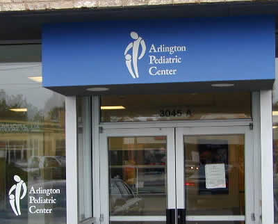
Arlington Pediatric Center
Junior Jazz Dance Class
Instituto de Estudos Orientais
Office of Government Commerce
Clinica Dental
The Computer Doctors
While it may be comical to view these unfortunate logo creations and ponder how their creators didn’t foresee the tragic misrepresentations, a valuable lesson must also be learned. A logo can make or break a company’s reputation. These examples also demonstrate the importance of obtaining alternate viewpoints on logo prototypes before a brand image is implemented. To avoid this misuse of creativity as a graphic designer, stick to the basic graphic design principles, adhere to the guidelines provided by your clients, and solicit advice on prototypes before sending them out to the public. By following this advice, you will avoid having your designs join the ranks of logos gone wrong. (bellefoong) |
| You are subscribed to email updates from hongkiat.com To stop receiving these emails, you may unsubscribe now. | Email delivery powered by Google |
| Google Inc., 20 West Kinzie, Chicago IL USA 60610 | |
No comments:
Post a Comment